Product Design • Industrial Design Project
Festool Rebrand
Role
Designer
Duration
4 weeks, 2024
Key Skills:
User Testing and Research
Physical Prototyping
Branding
User Interviews
Tools:
Adobe Suite
Google Suite
Final product
What: This new design supports a new market of gardening tools that relies on alternative forms and innovative ideas that bring comfort and function.
Studying the brand to incorporate seeing the actual product, packaging, and follow the same values, but a newer vision of comfort and functionality to develop a new line of gardening tools.
Why: By taking the key values from FESTOOL and studying the brand and placing a new market of gardening with its own values, the ability to translate interaction and purpose into a design is gained through this process.
Background
Inspiration, Preliminary Sketches and Models
Initial ideation began with simple orthographic drawings of product forms. Experiment with the forms of the handle to see what fits the comfort of the hand and how to appeal to the audience aesthetically. And seeing the original problems of the hand trowel tool to improve comfort.
Design Intention
Visual Brand Language
Packaging design that supports FESTOOL brand
That meant giving the products a cohesive brand language.
I decided to make the look with thin profiles and rounded edges to make the products feel more personal, consumer-driven, and desirable.
FESTOOL is known for its bright green that would be used to highlight the interaction/function points that can bring
Final Design- Refined Concept
For the final concept, came with logistical questions of ways I can improve the product. Consistent minor improvements and testing from other people
Form Exploration
I experimented with forms that communicated a tool with a strong gardening brand identity that is ergonomic, intuitive, and beautiful
Final Form Model
Project Reflection
Product form that communicates functionality and comfort
Gardeners feel comfortable and encouraged to garden
Gardeners feel more ownership over and in touch with products
More motivation to use them properly and trust the brand
By extracting key values from FESTOOL and the original hand trowel, I learned how to analyze the trouble with the tool critically and what was needed to develop what is needed for a new brand. This experience allowed me to develop a sensitivity to form a product from a company that existed and develop the tool to be better suited for the consumer while learning the actual experience of manufacturing.
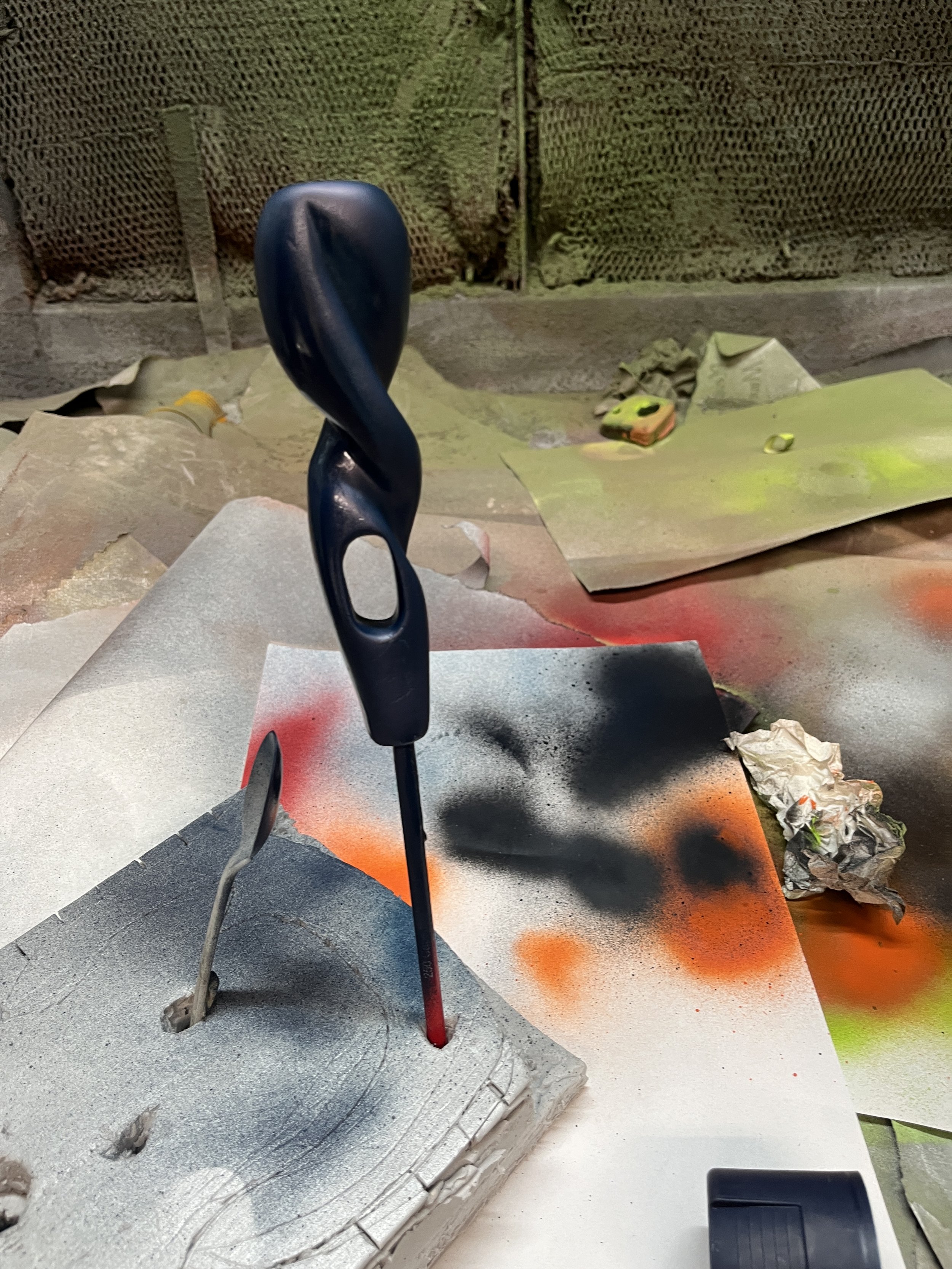
Craft process
Made out of metal wood and metal to see what the process of a real-life product will look like
Styrene is used for model making for size and visual ideas. Final with thicker aluminum with metal bending and metalworking and wood working.
Using inspiration from the accurate FESTOOL packaging that follows a minimal and clean packaging with clear icons.
Green follows the brand identity but creates a new identity for the line of tools.


